Watch me print!

I am a trained Risograph and screen printing technician, which not only influences my illustration but enables me to produce my own prints, exactly as they should be!
I personally print and hand finish all of my greetings cards and art prints up to the size of A3, so you are getting a product that I exclusively have worked on from inception to production.
I personally print and hand finish all of my greetings cards and art prints up to the size of A3, so you are getting a product that I exclusively have worked on from inception to production.
Here I am going to walk through my print process on my four-colour Tulips print, showing the decisions I make to achieve the best quality prints for you.
Like all the printers I know, I can get very boring and talk for hours on the subject, so if you want to skip ahead for the satisfying video at the end I won’t be offended - in fact I won’t even know!
Like all the printers I know, I can get very boring and talk for hours on the subject, so if you want to skip ahead for the satisfying video at the end I won’t be offended - in fact I won’t even know!
1. Illustration & artworking
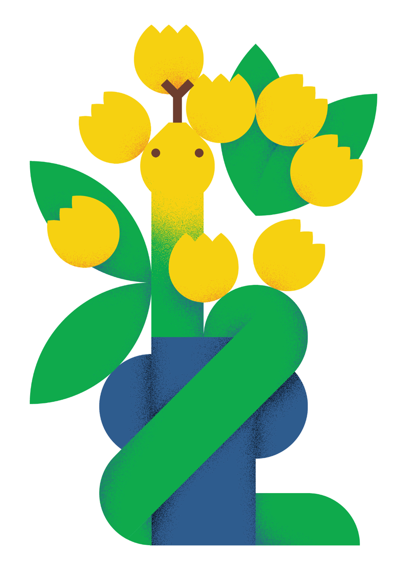
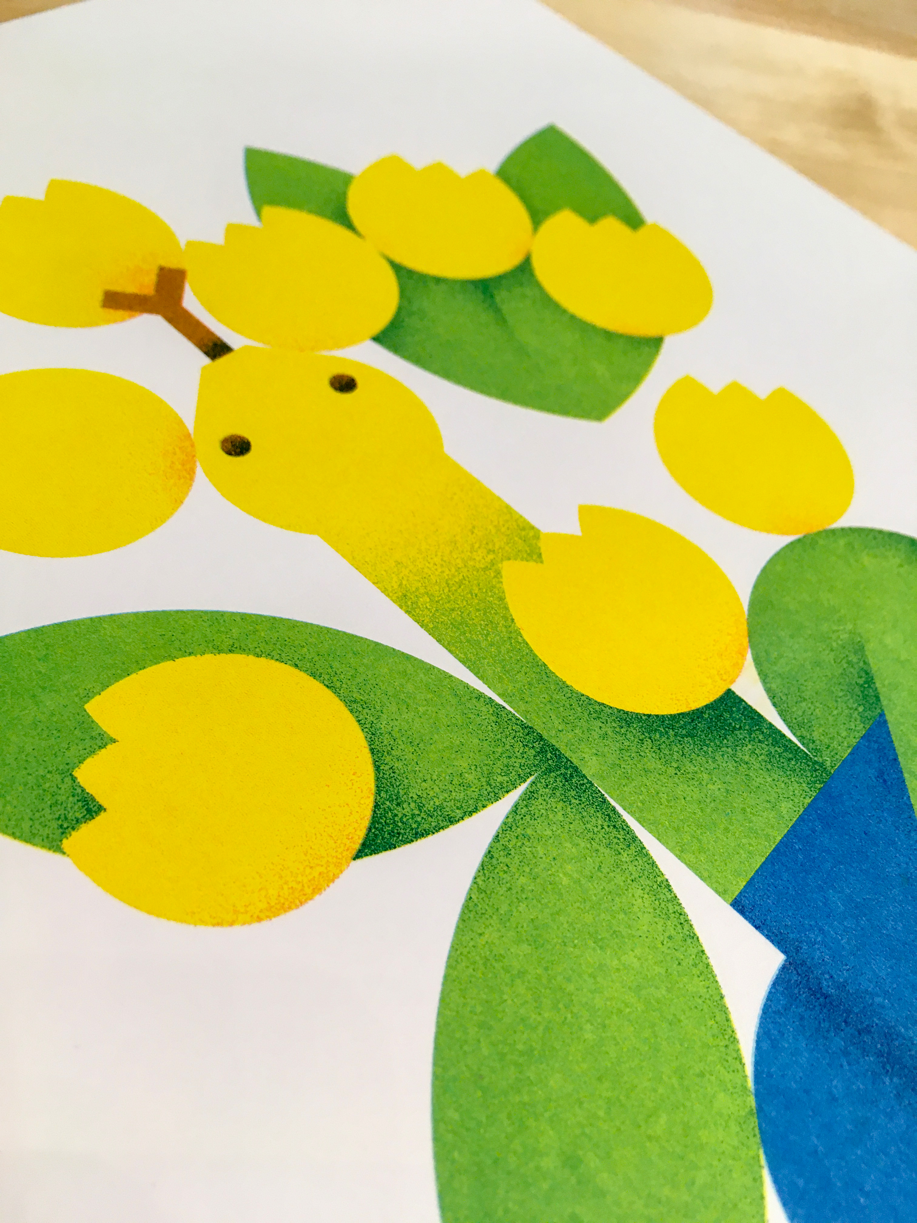
After working on pencil sketches, I make my illustrations digitally. My illustrations are made up of bright, simple colours, influenced by what I can reproduce with Riso inks. Riso, like screen printing, is a spot colour process, and I can create a range of colours by layering different intensities of inks. This illustration is mainly made up of yellow, green and blue, but also contains some red, brown and black. I have decided to use a CMYK process to reproduce these colours, so I will use just 4 inks to recreate the 6 colours. I separate my artwork into 4 “stencils”, one for each ink.
After working on pencil sketches, I make my illustrations digitally. My illustrations are made up of bright, simple colours, influenced by what I can reproduce with Riso inks. Riso, like screen printing, is a spot colour process, and I can create a range of colours by layering different intensities of inks. This illustration is mainly made up of yellow, green and blue, but also contains some red, brown and black. I have decided to use a CMYK process to reproduce these colours, so I will use just 4 inks to recreate the 6 colours. I separate my artwork into 4 “stencils”, one for each ink.

2. Test print first pass
I can print two inks at a time so I print Yellow and Red together in the first pass. These are my M and Y inks.
My priority in this pass is to achieve the best yellow possible for the flowers - however I have printed this yellow so many times that it isn’t really a worry, and I am happy with it straight away.
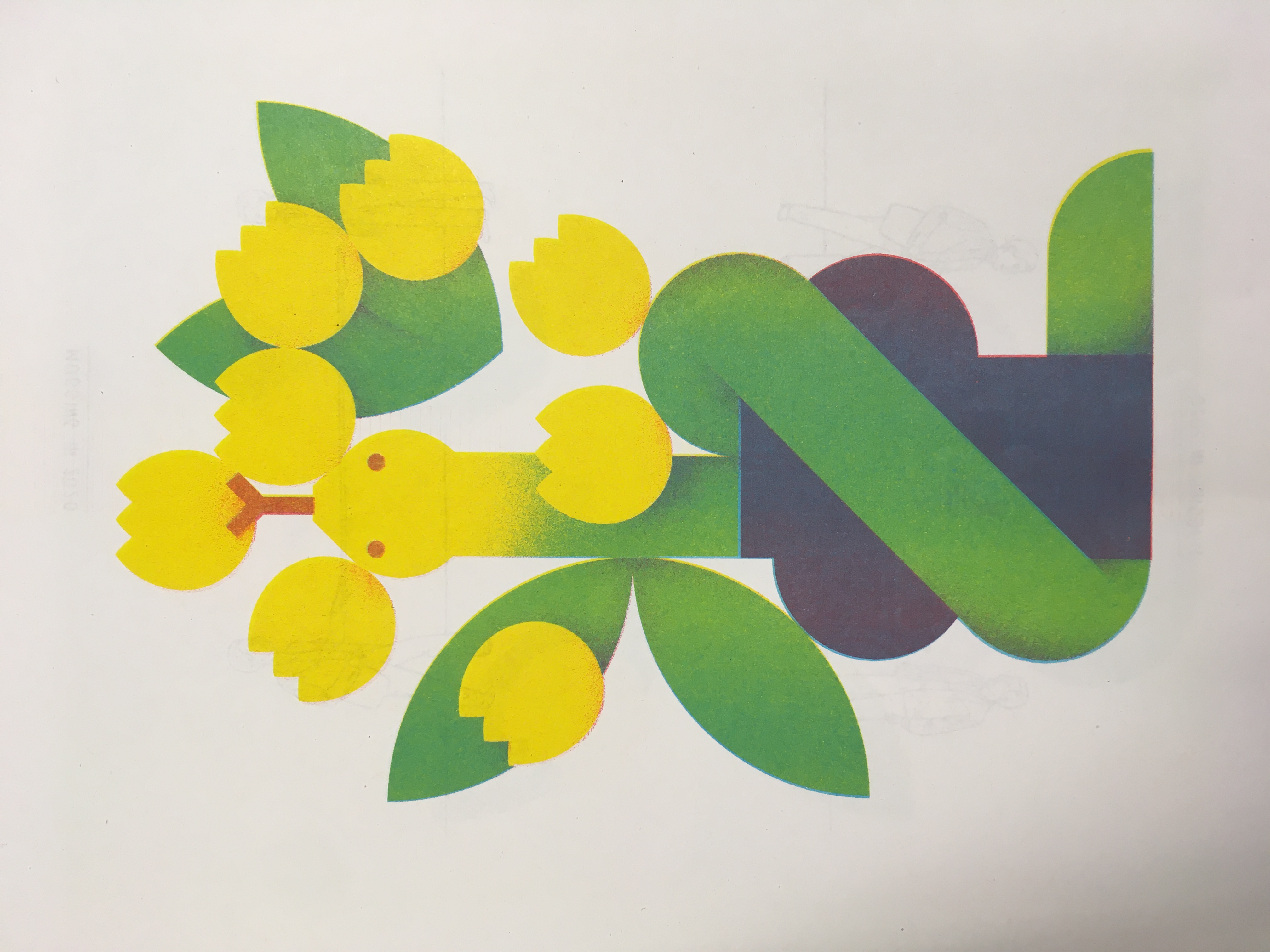
3. Test print second pass
In the second pass I am printing my C and K inks - Aqua Blue and Black.
I then review the print. I don’t mind about registration at this point, my focus is on gauging how the inks have meshed together.
The yellow is perfect, and I am very happy with the green.
The brown of the snake’s features are too red, and the blue vase is muddied with no definition. The Aqua Blue and Red used on the vase have created a blue-y purple, but reducing the Red would wash it out and move the colour even further away from the intense blue that I am aiming for.
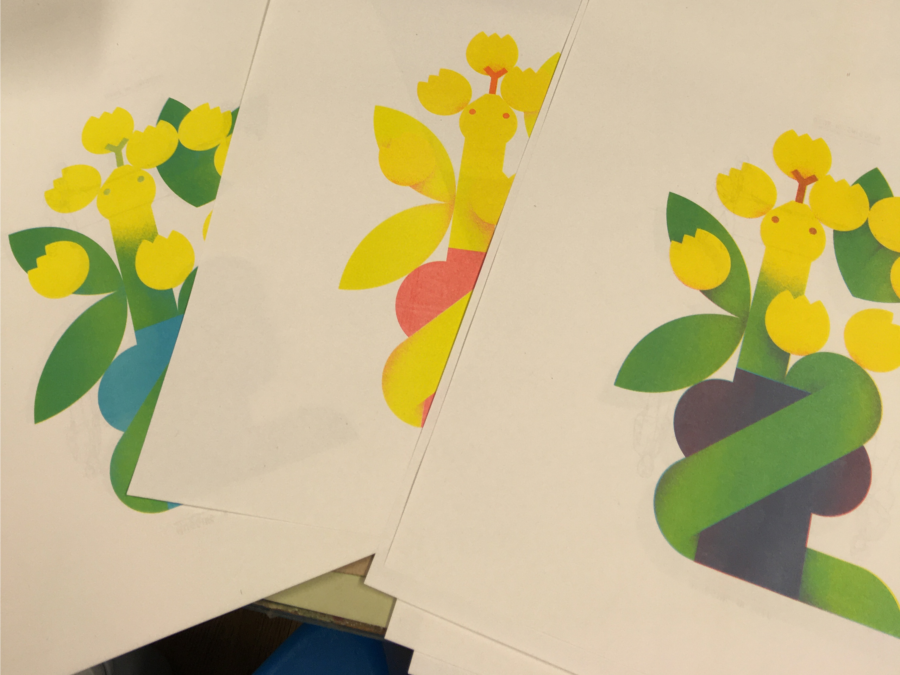
4. Re-artworking
I now go back to my original separations and make new “stencils” based on what my test print has shown me. I can easily fix the redness of the snake’s brown features by increasing my C and K layers in this area. I don’t want to change my Yellow layer at all, but I need to tweak the Red and Aqua Blue for the vase, and I am going to completely change my K layer.
I now go back to my original separations and make new “stencils” based on what my test print has shown me. I can easily fix the redness of the snake’s brown features by increasing my C and K layers in this area. I don’t want to change my Yellow layer at all, but I need to tweak the Red and Aqua Blue for the vase, and I am going to completely change my K layer.
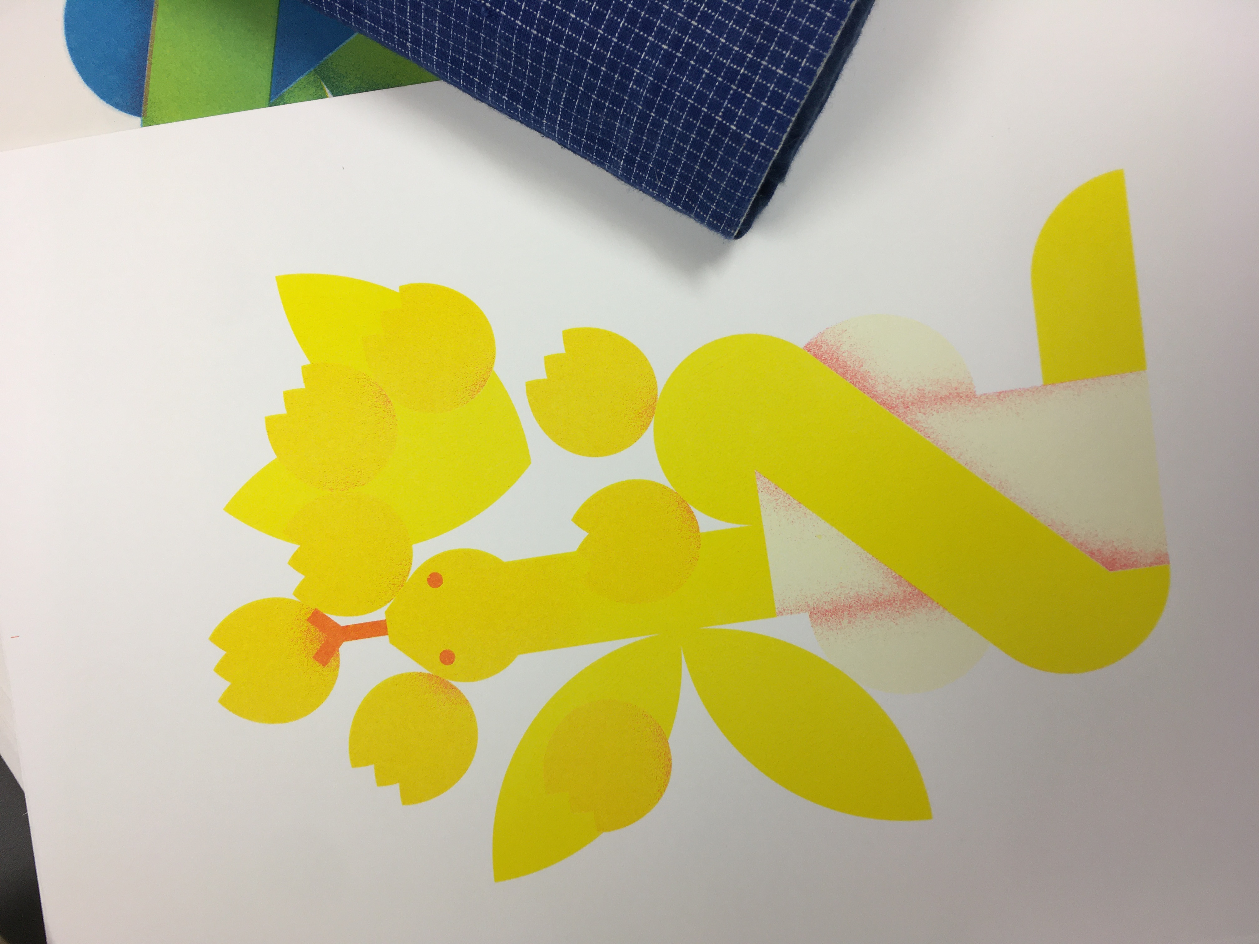
5. First pass
I have removed the block of Red behind the vase, and replaced the Black shading with Red, as it will create a dark colour when the blue ink is overlaid. Other than that this pass has remained pretty much the same, with no change at all to the Yellow.
Sidenote: I don’t really like the official Riso Yellow ink (it’s so flourescent it’s a bit like a highlighter pen!), so whenever using yellow in my prints I put a very light layer of red or orange underneath to soften it. You can see this in the photo here, as the flowers are noticably warmer than the bright yellow leaves.

6. Second pass - comparison to original
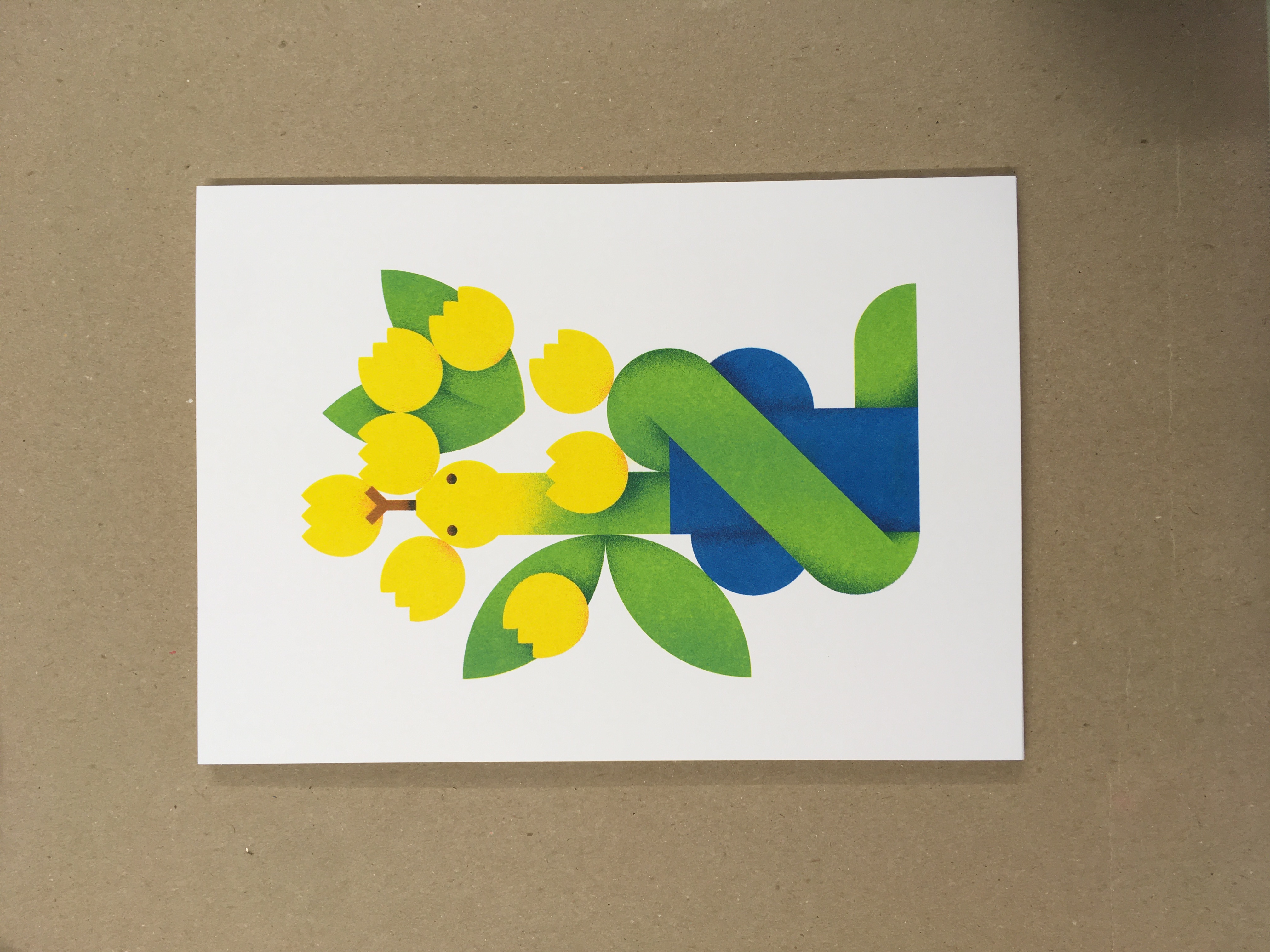
Whilst I have kept the Aqua Blue layer basically the same, I have completely replaced my black K layer with a deep, darker blue. It is the perfect rich tone for the vase. For the areas of shading that were originally Black, the dark blue has layered with the Red and lighter blue to create a darker colour altogether. This has negated the need for Black at all, and created an overall brighter, clearer print.
These changes were totally worth it. I am happy with all the colours, and can start the run!
7. Printing the run
I print the small run on to heavy 240GSM white paper stock at SRA4 size, which is slightly larger than A4 and allows me to print tiny registration marks at the edges of the paper, which I will trim off later. I pride myself on tight registration on all of my art prints, so the print always looks highly finished. I maintain constant speeds when printing, which helps me to avoid fluctuations in colour across the run. Risographs are quite temperamental machines, so no two prints are exactly alike and this is part of their charm, but I maintain a very high standard of quality control!
8. Finishing
Once the print run has ended I interleave the prints with thin recycled paper to avoid any transfer on to the back, and trim them to their final A4 size, removing the registration marks. The print is now ready!
You can buy this limited edition print from my webshop here. Feel free to get in touch if you would like to know more about my process!
![]()
![]()
I print the small run on to heavy 240GSM white paper stock at SRA4 size, which is slightly larger than A4 and allows me to print tiny registration marks at the edges of the paper, which I will trim off later. I pride myself on tight registration on all of my art prints, so the print always looks highly finished. I maintain constant speeds when printing, which helps me to avoid fluctuations in colour across the run. Risographs are quite temperamental machines, so no two prints are exactly alike and this is part of their charm, but I maintain a very high standard of quality control!
8. Finishing
Once the print run has ended I interleave the prints with thin recycled paper to avoid any transfer on to the back, and trim them to their final A4 size, removing the registration marks. The print is now ready!
You can buy this limited edition print from my webshop here. Feel free to get in touch if you would like to know more about my process!
© Emma Jane Semmens 2021
For more information or to discuss future projects get in touch here
For more information or to discuss future projects get in touch here